Visualizations
All the previous data pre-processing was done in jupyter notebook with python however in order to produce quality visualizations, I saved my datasets as csv files and read them into Tableau. Below is the dashboard I created.
With the COVID-19 epidemic currently happening worldwide, many peoples’ lives have been dramatically affected. However, due to the contagious nature of the disease, a big reason for its exponential spread is human ignorance and lack of information surrounding the virus. For example, when the outbreak took over Italy, many Italians were cautioning Americans to stay inside and take the warnings seriously, because if we didn’t, we would soon see a spike in our cases like they had. Unfortunately, we did not listen and weeks later, the United States became the country with the most coronavirus cases.
I want to look at this epidemic from two points of view: the hard facts and human awareness. Since outbreaks of the virus happened at significantly different times in each region, I want to see how that affects the overall distribution of human curiosity in each region while keeping an eye on their unique number of confirmed cases, recoveries, and deaths. I am hoping to identify trends and see if there is a relationship between awareness and physical cases.
The two data sources I used were Google Trends API and World Health Organization Coronavirus Source data.
Since the scope of focus for this project was quite large (encompassing the whole world), my goal was to first create choropleth graphs for each of my datasets individually so I could get a visual representation of all the data at once. Then, I would use those graphs to identify what I wanted to look for once I combined the datasets together. Despite the fact that I was only displaying information for one dataset at a time, I actually still had to merge each dataset with a shapefile, which contained the geometry polygons of the countries.
When merging, I noticed the number of NaNs I got was abnormally large, considering that I was merely joining on “country name” which shouldn’t have too much variance. After some exploration, I discovered that the cause of this was different spelling of country names. For example, in the Google Trends API, the US was referred to as “United States” but in the shapefile, the US was referred to as “United States of America”. Therefore, in order to make sure I was not accidentally leaving out information, I did a lot of manual replacing of country names.
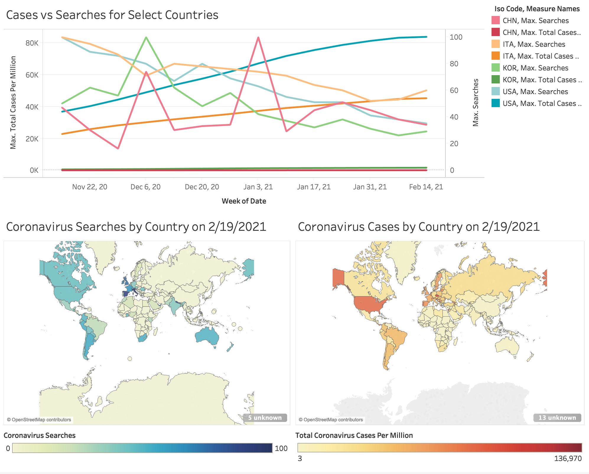
Once I got a look at the datasets individually, I was ready to start processing the datasets together. I wanted to look at the distribution of searches alongside the distribution of total cases over a fixed period of time, but because there were too many countries and too much data, I decided to hone in on 4 major countries: the United States, Italy, China, and Korea. I chose these not only based on what I saw from the two choropleth graphs, but also based on what I had been hearing on the news. I chose the United States and Italy because they were the two countries which encountered extreme exponential growth in cases. I chose China because that was the initial location of the virus outbreak. Lastly, I chose Korea, because it seemed like a good control. Although they had experienced their fair share of cases, they were very quick to respond to the outbreak and keep it under control.
For each country, I made a separate request to the Google Trends API and filtered the Our World in Data Coronavirus Source data respectively. In order to eventually display the data nicely as a time series plot, I had to merge each pair of datasets on time. Because some times were in one but not the other, I decided to use an inner join and only keep the times that were both.
All the previous data pre-processing was done in jupyter notebook with python however in order to produce quality visualizations, I saved my datasets as csv files and read them into Tableau. Below is the dashboard I created.
For the map graph on the bottom left, the bar gauges search volume index, which isn’t directly proportional to how many searches but is instead search interest relative to the country with the most searches. Thus, although it seems as though many countries do not search about “coronavirus” at all, scores of 0 either mean there was not sufficient amount of data or that relative to other countries, they searched the term significantly less. As seen in the graph, the leading countries searching for “coronavirus” are Italy and Spain while countries like the United States and Australia trailed behind. Other countries like China and Korea stayed around 0 which at first, made me a bit confused. However with more in depth research, I noticed that it may be due to the multilingual nature of our world. “Coronavirus” is an English word so other countries may be searching it with a different name which could be making the map more reflective of English-language web users.
Similarly, I created this choropleth graph for the total coronavirus cases per million in each country by 2/19/2021. Unlike the previous graph, the bar on the bottom right is not relative so it is strictly the number of coronavirus cases the country has had up until the 19th of February. This one was a lot more intuitive for me to understand and with one glimpse, you can easily tell that the United States has way more cases than anywhere else in the word. After the US, the next country is Spain but drops to almost to half the number of cases.
For the graph with the two datasets combined, I wanted to display the distribution of searches alongside the distribution of total cases over a fixed period of time. Initially, I had each country as a separate graph, but I realized if I really wanted to draw meaningful insights, it would be better to put them all on one graph. Looking at the final graph on the very top of the dashboard, you can easily compare the distributions between countries. Korea’s total cases never really exploded, growing a little but staying quite constant otherwise. China’s cases on the other hand increased quite steeply, but quickly leveled to follow a logarithmic distribution. Italy’s cases initially grew exponentially but slowed down and became more linear. Lastly, the United States’s cases blew up exponentially and are still growing very fast.
Comparing these to their respective search distributions, China has maintained constant spikes of interest and in comparison to other countries, China is definitely the best at still keeping themselves informed. The other three countries USA, Italy and Korea show a very obvious drop in searches with USA dropping the most relative to searches in November. Although not present in this graph, I previously made some insights from data from early 2020. In China’s case, since their first case happened before every other country, their searches peaked way earlier back in mid-January. From mid-January to mid-February the searches fell but have been slowly increasing again. Italy’s interest peaked in mid to late February, dropping and then increasing again before the cases started growing in mid-March. Since then, the interest has been constantly falling. Lastly, the US had minimal interest in the virus initially, but interest grew exponentially late February to mid-March before many cases were present. Interest decreased right as total cases started increasing exponentially.
From this analysis, I feel it is safe to say there is a correlation between constant interest and coronavirus cases. Although every country has spikes in their interest, the countries that have been able to keep their cases under control are ones that haven’t lost interest in the virus since their first case. As a new and very deadly virus, there will always be things that need to be learned about the disease and the best way to stay alert, informed and safe is constantly educating yourself and sustaining interest.